
Translating technical data into visualizations
Translating technical data into visualizations
Translating technical data into visualizations
Translating technical data into visualizations
Purpose
Create an enterprise level tool for internal users to monitor data from millions of GM EVs and visualize patterns to debug
Challenge
How can we create visualizations that compare multiple variables within specific populations?
Results
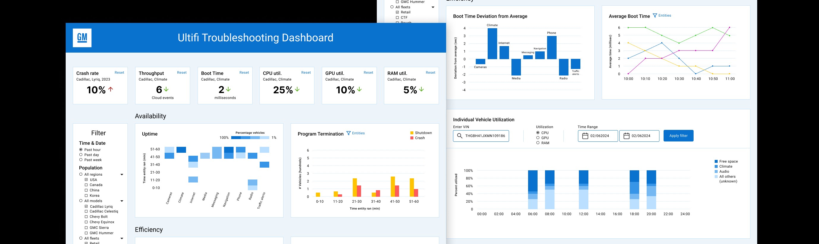
A dashboard that highlights key insights while comparing entity data within filtered populations
Purpose
Create an enterprise level tool for internal users to monitor data from millions of GM EVs and visualize patterns to debug
Challenge
How can we create visualizations that compare multiple variables within specific populations?
Results
A dashboard that highlights key insights while comparing entity data within filtered populations
Brainstorming Workshops
I was charged with creating a data dashboard that visualizes data from GM's test, commercial and retail vehicles. Leadership and engineers would use this data to detect and troubleshoot issues in the vehicles.
The data we receive is very technical. I worked with a technical Product Manager to decode it. But we still wanted to go to the source for how to visualize it.

We identified 3 groups of users- software engineers, software architects, and leaders (software and occasionally executives). Each group was put into a workshop together.
We briefed each workshop group about the prompt, showed them some examples of graphs and use cases, then gave them time to draw their own.
Each participant presented their ideas and we gave them a few minutes to vote on which ideas they felt would be most impactful. Then I led an open discussion about the reasoning behind their votes.
Problem
We identified 3 groups of users- software engineers, software architects, and leaders (software and occasionally executives). Each group was put into a workshop together.
Solution
We briefed each workshop group about the prompt, showed them some examples of graphs and use cases, then gave them time to draw their own.
Results
Each participant presented their ideas and we gave them a few minutes to vote on which ideas they felt would be most impactful. Then I led an open discussion about the reasoning behind their votes.
We identified 3 groups of users- software engineers, software architects, and leaders (software and occasionally executives). Each group was put into a workshop together.
We briefed each workshop group about the prompt, showed them some examples of graphs and use cases, then gave them time to draw their own.
Each participant presented their ideas and we gave them a few minutes to vote on which ideas they felt would be most impactful. Then I led an open discussion about the reasoning behind their votes.
Problem
We identified 3 groups of users- software engineers, software architects, and leaders (software and occasionally executives). Each group was put into a workshop together.
Solution
We briefed each workshop group about the prompt, showed them some examples of graphs and use cases, then gave them time to draw their own.
Results
Each participant presented their ideas and we gave them a few minutes to vote on which ideas they felt would be most impactful. Then I led an open discussion about the reasoning behind their votes.
Too many cars, too many apps
Originally, my thought was to create graphs that could visualize all the apps, from every car. After listening to the engineers, I realized that the challenge would be to figure out how to aggregate data across vehicle populations and apps. They had no need to diagnose every car individually. They needed to compare apps between different populations of cars.
These are very rough first iterations of the graphs with notes.

Reviewing wireframes with engineers
I created some wireframes of the graphs that were top voted at the workshops and put them into a wireframe. Then I met with the engineers and architects again to iterate further.
Reviewing wireframes with engineers
I created some wireframes of the graphs that were top voted at the workshops and put them into a wireframe. Then I met with the engineers and architects again to iterate further.
Reviewing wireframes with engineers
I created some wireframes of the graphs that were top voted at the workshops and put them into a wireframe. Then I met with the engineers and architects again to iterate further.
Reviewing wireframes with engineers
I created some wireframes of the graphs that were top voted at the workshops and put them into a wireframe. Then I met with the engineers and architects again to iterate further.

Final Version of the Dashboard


The filter
Includes many variables to granularly filter out populations
The filter
Includes many variables to granularly filter out populations

High level view
Leadership asked for a few metrics to be pinned at the top, so they can diagnose fleets at a glance
High level view
Leadership asked for a few metrics to be pinned at the top, so they can diagnose fleets at a glance

Heatmaps
Used to visualize uptime, CPU, GPU, RAM
Highlight areas of irregularity and granular comparisons if needed
Plots 3 variables
Comparison between entities
Heatmaps
Used to visualize uptime, CPU, GPU, RAM
Highlight areas of irregularity and granular comparisons if needed
Plots 3 variables
Comparison between entities

Grouped bar charts
Used to visualize program termination, throughput
Compares parent categories (time intervals)
Compares sub-categorical variables (ie. shutdowns vs crashes)
Grouped bar charts
Used to visualize program termination, throughput
Compares parent categories (time intervals)
Compares sub-categorical variables (ie. shutdowns vs crashes)
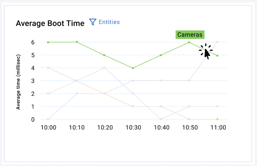
Line graph
Used to visualize average boot time
Compares trends across time
Filter one or multiple entities
Line graph
Used to visualize average boot time
Compares trends across time
Filter one or multiple entities

Deviation bar chart
Used to visualize boot time deviation
compares deviations from average
see very fast and very slow boot times
Deviation bar chart
Used to visualize boot time deviation
compares deviations from average
see very fast and very slow boot times
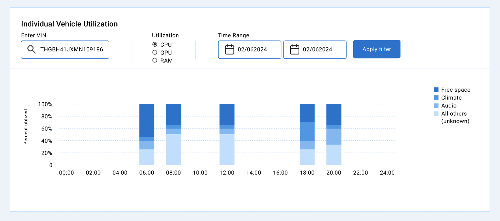
100% stacked bar chart
Used to visualize individual vehicle utilization
Compares relative differences between category quantities
can be confusing with more categories, but used to see outliers
100% stacked bar chart
Used to visualize individual vehicle utilization
Compares relative differences between category quantities
can be confusing with more categories, but used to see outliers
Breakdown of Graphs
Breakdown of Graphs
Breakdown of Graphs
Breakdown of Graphs
The filter
Includes many variables to granularly filter out populations
The filter
Includes many variables to granularly filter out populations
High level view
Leadership asked for a few metrics to be pinned at the top, so they can diagnose fleets at a glance
High level view
Leadership asked for a few metrics to be pinned at the top, so they can diagnose fleets at a glance
Heatmaps
Used to visualize uptime, CPU, GPU, RAM
Highlight areas of irregularity and granular comparisons if needed
Plots 3 variables
Comparison between entities
Heatmaps
Used to visualize uptime, CPU, GPU, RAM
Highlight areas of irregularity and granular comparisons if needed
Plots 3 variables
Comparison between entities
Grouped bar charts
Used to visualize program termination, throughput
Compares parent categories (time intervals)
Compares sub-categorical variables (ie. shutdowns vs crashes)
Grouped bar charts
Used to visualize program termination, throughput
Compares parent categories (time intervals)
Compares sub-categorical variables (ie. shutdowns vs crashes)
Line graph
Used to visualize average boot time
Compares trends across time
Filter one or multiple entities
Line graph
Used to visualize average boot time
Compares trends across time
Filter one or multiple entities
Deviation bar chart
Used to visualize boot time deviation
compares deviations from average
see very fast and very slow boot times
Deviation bar chart
Used to visualize boot time deviation
compares deviations from average
see very fast and very slow boot times
100% stacked bar chart
Used to visualize individual vehicle utilization
Compares relative differences between category quantities
can be confusing with more categories, but used to see outliers
100% stacked bar chart
Used to visualize individual vehicle utilization
Compares relative differences between category quantities
can be confusing with more categories, but used to see outliers
The filter
Includes many variables to granularly filter out populations
High level view
Leadership asked for a few metrics to be pinned at the top, so they can diagnose fleets at a glance
Heatmaps
Used to visualize uptime, CPU, GPU, RAM
Highlight areas of irregularity and granular comparisons if needed
Plots 3 variables
Comparison between entities
Grouped bar charts
Used to visualize program termination, throughput
Compares parent categories (time intervals)
Compares sub-categorical variables (ie. shutdowns vs crashes)
Line graph
Used to visualize average boot time
Compares trends across time
Filter one or multiple entities
Deviation bar chart
Used to visualize boot time deviation
compares deviations from average
see very fast and very slow boot times
100% stacked bar chart
Used to visualize individual vehicle utilization
Compares relative differences between category quantities
can be confusing with more categories, but used to see outliers